
Brick River Platform Redesign
Modernizing a complex nonprofit SaaS platform into a unified, task-focused experience.
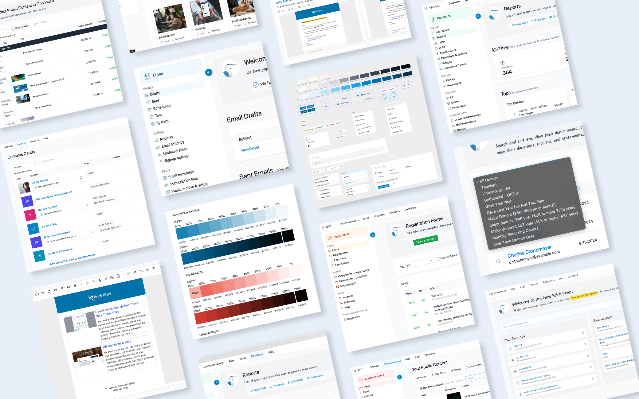
Brick River is an all-in-one nonprofit SaaS platform used by 5,000+ staff to manage communications, fundraising, websites, events, contacts, and organizational data.
I led the platform redesign to simplify navigation, modernize the interface, and create a more consistent, intuitive experience. A major focus was reorganizing the platform around task-based Centers, making it easier for users to find the tools they need and complete everyday workflows.
Design QuestionHow might we modernize a legacy platform into a unified, task-focused experience that simplifies workflows and supports scalability?
Key Contributions
Simplified Navigation
Reorganized the platform around task-based Centers, making common workflows easier to find and understand.
Scalable Design System
Built reusable components and UI standards to improve consistency and support future growth.
Modernized Interface
Transitioned from Bootstrap toward Tailwind CSS while continuing to support legacy features.
Improved Complex Workflows
Introduced a collapsible sidebar, improved tables, filtering, and interaction patterns to simplify everyday tasks.
More Approachable Experience
Introduced friendlier language, custom illustrations, subtle color, and clearer feedback to make the software feel more human.
Design System
Brick River Platform Redesign
Project: Brick River Software Product Design & Front-End Development
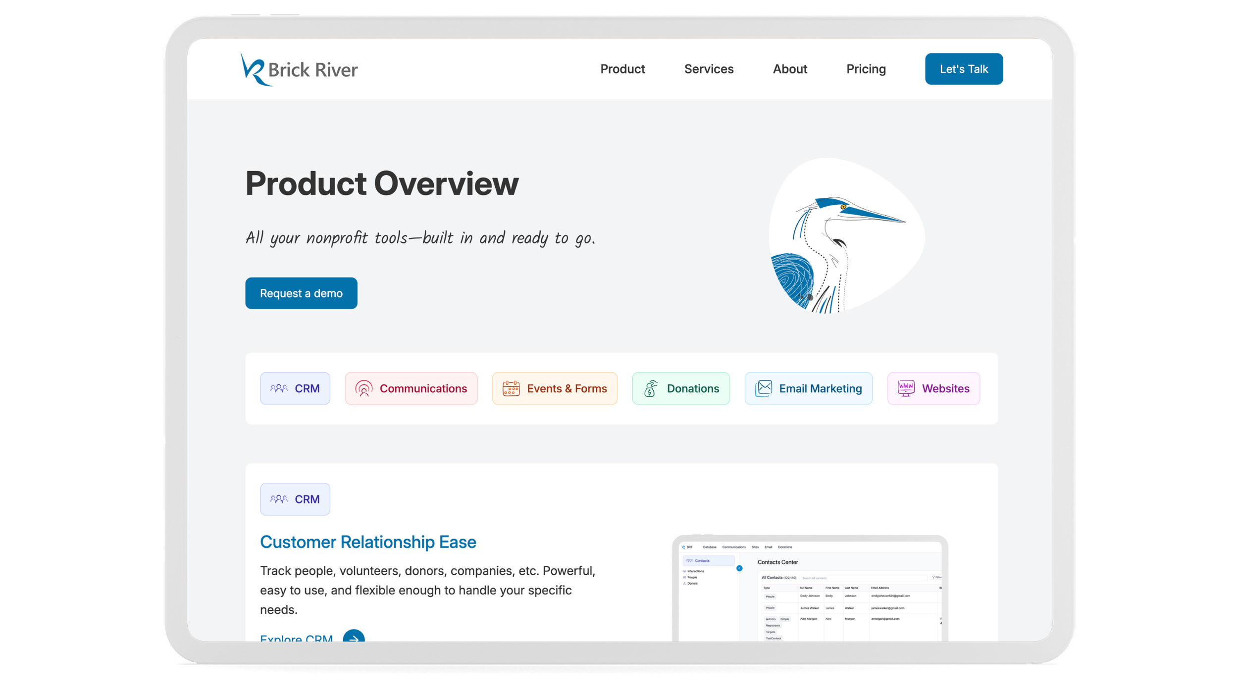
Description: Brick River is an integrated nonprofit SaaS platform used by 5,000+ nonprofit staff to manage communications, fundraising, websites, events, contacts, and organizational data.
As lead Product Designer and Front-End Developer, I redesigned the platform to make it easier to understand and navigate. I simplified how information was organized, created a more consistent look and feel, and built reusable patterns that could be used across the product.
One of the biggest changes was replacing long, cluttered dropdown menus with task-based centers, giving users a clearer place to go depending on what they were trying to accomplish.
Software: Figma, Visual Studio, Git, HTML, CSS, JavaScript, Tailwind CSS, Bootstrap, Razor, C#, DataTables, ChatGPT
Design Question: How might we modernize a legacy platform into a unified, task-focused experience that simplifies complex workflows while improving scalability and consistency?
Key Contributions
Simplified Navigation
Reorganized the platform around task-based centers, making common workflows easier to find and understand.
Created a Scalable Design System
Built reusable components and UI standards to keep the platform consistent and easier to scale.
Modernized the Interface
Updated the product from its older Bootstrap-based UI toward a more flexible Tailwind system while continuing to support legacy areas of the platform.
Improved Complex Workflows
Introduced a collapsible sidebar, improved tables, filtering, and workflow patterns to make complex tasks easier to complete.
Made the Product Feel More Human
Introduced friendlier language, custom illustrations, subtle color, and clearer feedback to make the software feel more approachable.
Design System
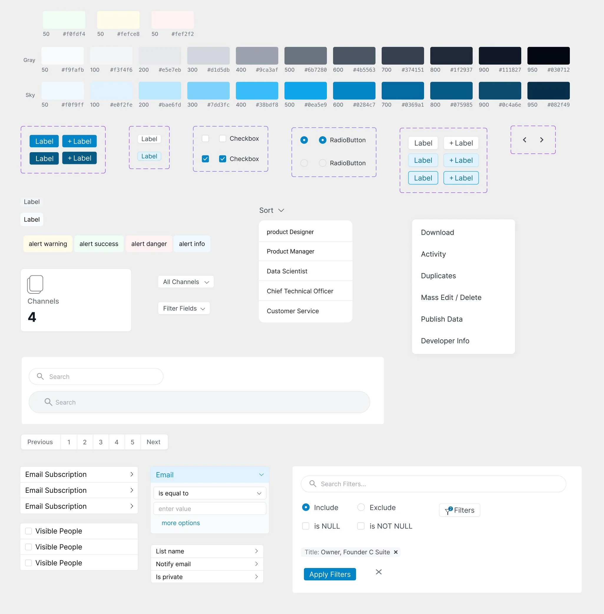
To keep the platform consistent as it grew, I built and maintained a reusable design system that gave the product and development teams a shared source of truth.
I used established systems like Material Design as a reference point, then adapted patterns to fit Brick River’s own workflows and visual language. Components were built in Figma with the states and variations needed for real product use, including default, hover, focus, active, disabled, and error states where relevant.
The system included colors, typography, form controls, filters, pagination, alerts, dropdowns, modals, data tables, and other common patterns used across the platform.
It became a reference point for the development team, helping us build new features faster while keeping the experience consistent across communications, donations, contacts, events, and websites.
Websites Center Before
Important actions were buried in long menus
The interface felt dated and inconsistent
Common tasks took too many steps to reach
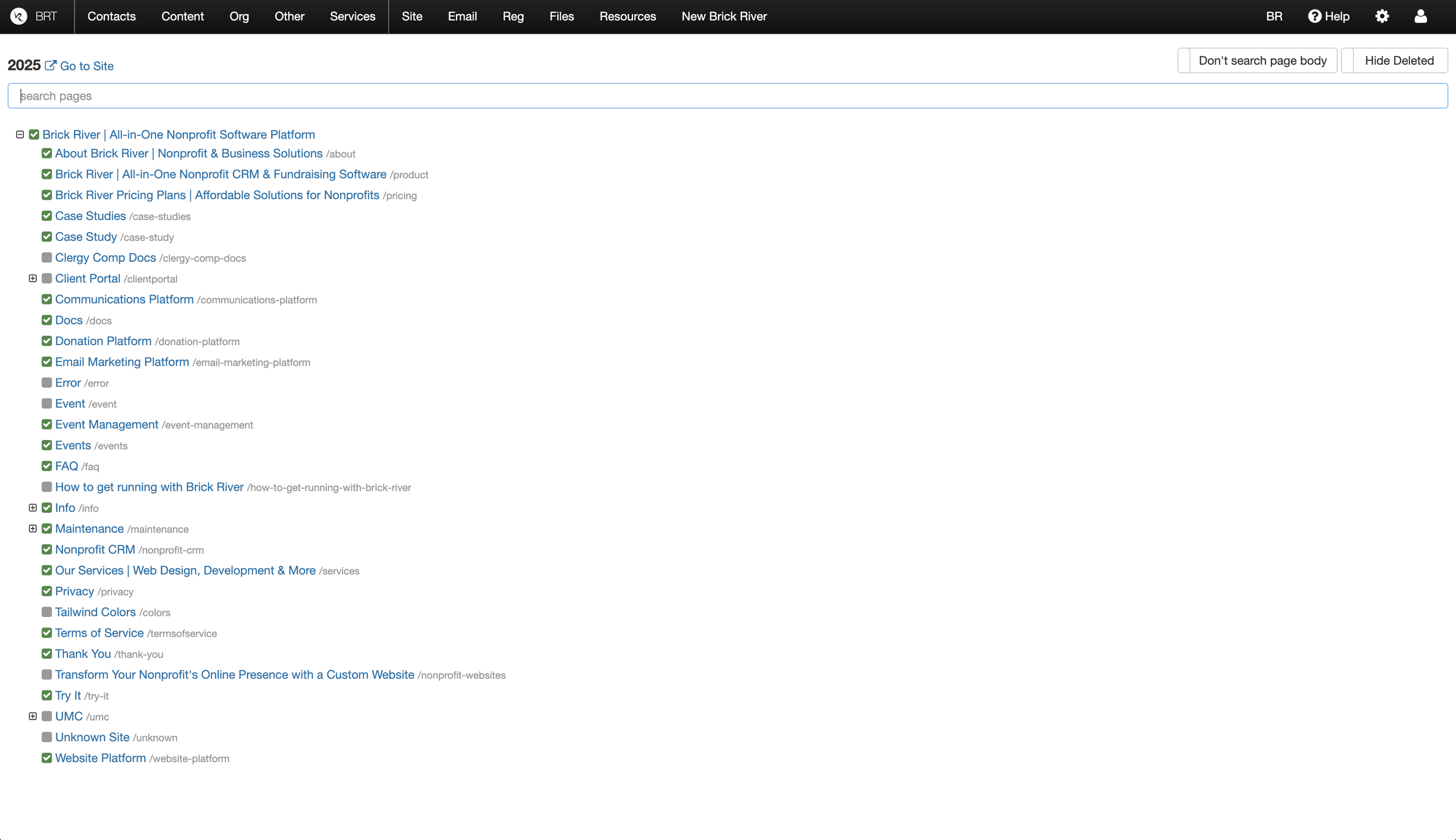
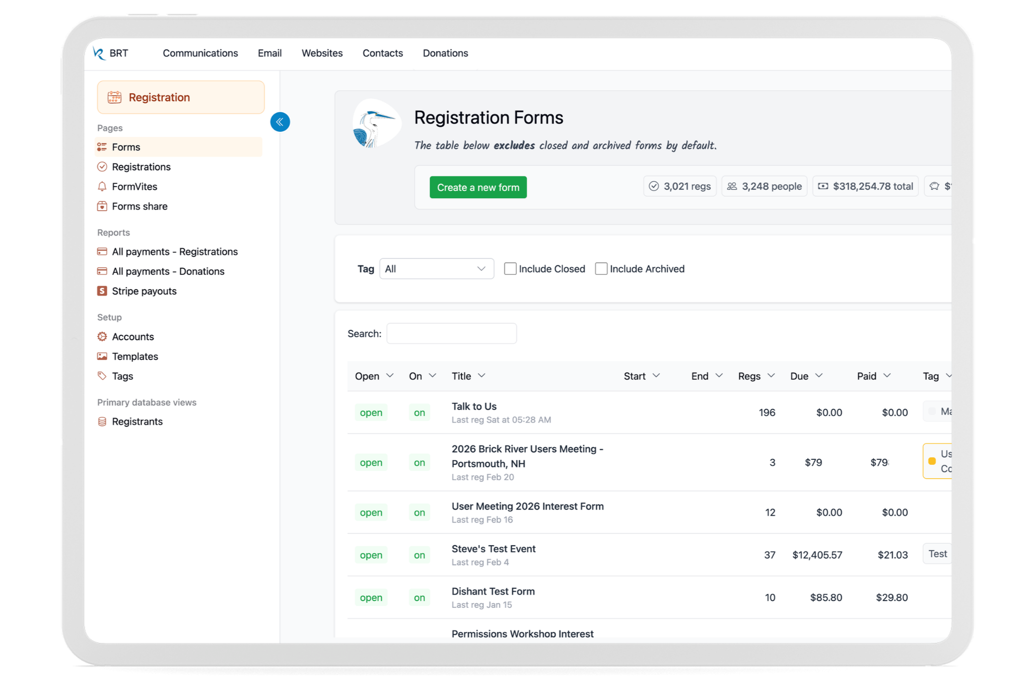
Websites Center After
Frequent tasks were easier to access through a collapsible sidebar
Important stats visible at a glance
Modern Tailwind interface with larger targets
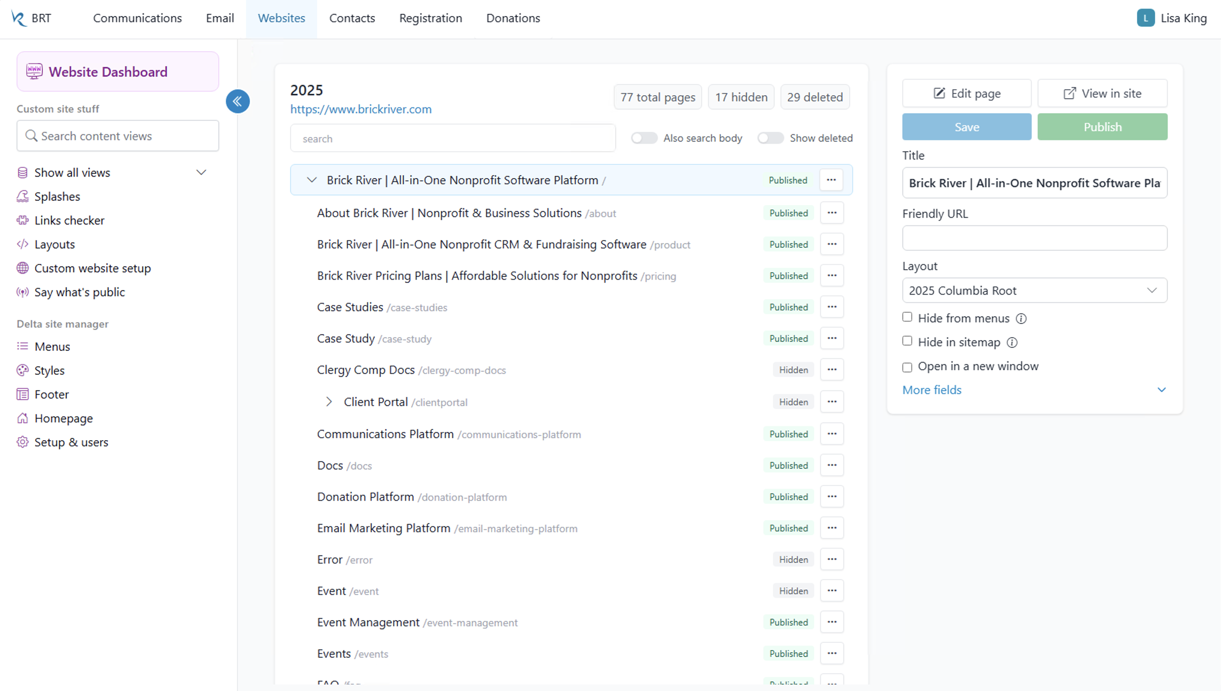
Contacts Center
Manage people, interactions, and donor data with search and filtering tools.
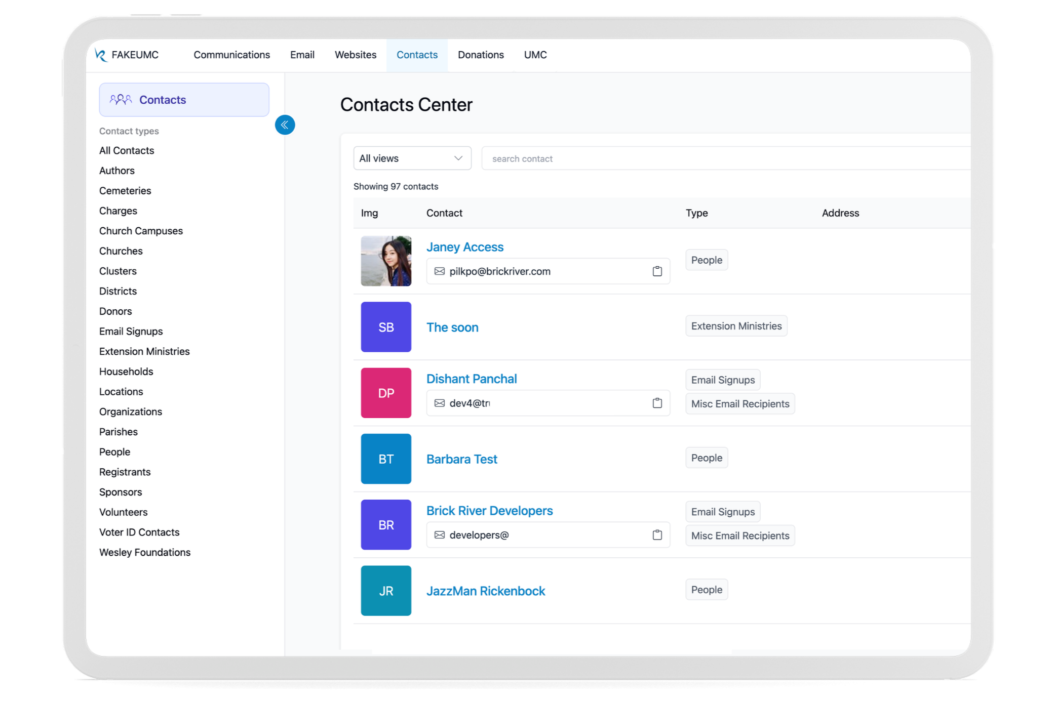
Communications Center
Manage and publish content across websites, brands, and public pages.
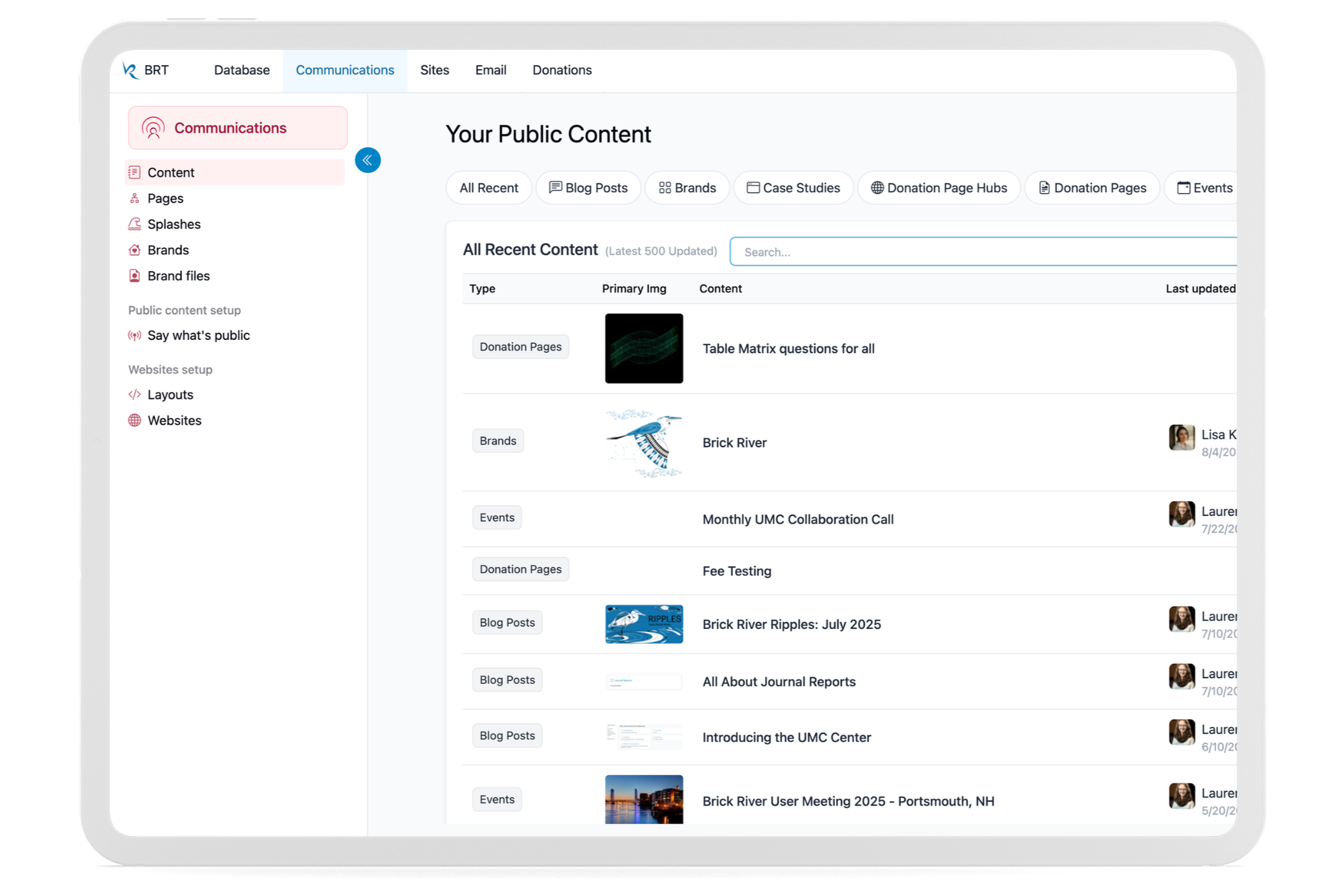
Registration Center
Create registrations, collect payments, and track participant data.
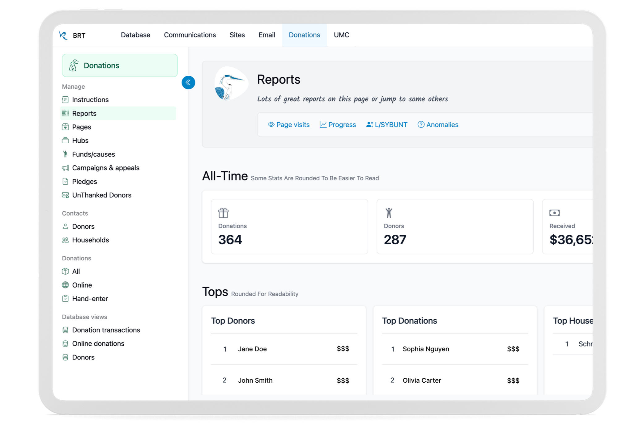
Donations Center
Manage campaigns, donor activity, and fundraising information in one place.
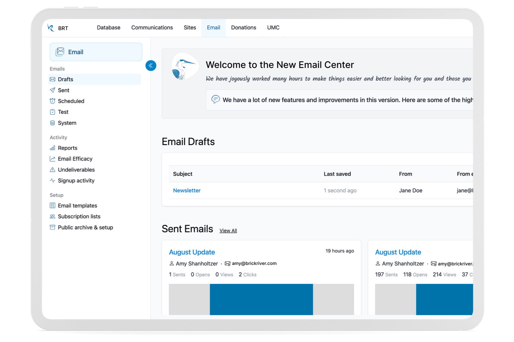
Email Center
Create, send, and review email campaigns through a clearer workflow.
Process & Insights
Start With How People Actually Work
Talking with nonprofit staff helped me understand where they got stuck, what they struggled to find, and which tasks mattered most. Those conversations directly shaped the redesign.
Design for the Whole System
Because Brick River includes many connected tools, I had to think beyond individual screens. New patterns needed to work across different workflows while still feeling familiar.
Work Within Legacy Constraints
The platform couldn't be rebuilt all at once. I designed new experiences that could coexist with older parts of the product, allowing us to improve the interface gradually without disrupting existing users.
Keep Iterating
The redesign continued to evolve as we gathered feedback from users and developers and introduced new features.
Conclusion
The Brick River redesign brought more clarity and consistency to a large, evolving software platform.
By organizing the experience around real user tasks and creating reusable patterns across the product, I helped make the platform easier to navigate while giving the team a stronger foundation for future development.