
Dakotas | Minnesota Foundation
Unifying two regional websites into one cohesive and accessible digital experience.
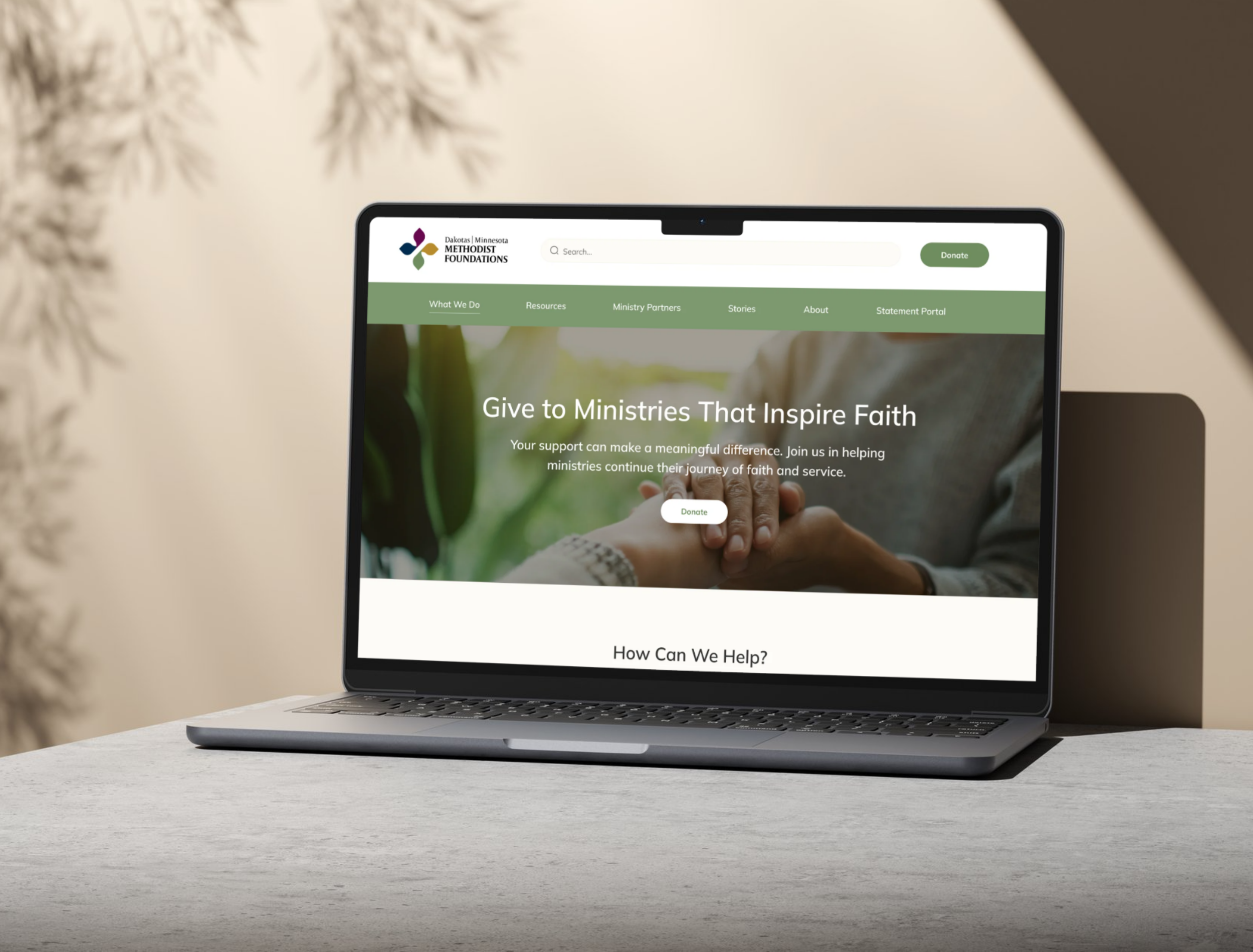
I designed and developed a unified website for the Dakotas | Minnesota Methodist Foundation, bringing two regional identities together into one website.
The redesign introduced dedicated landing pages for each region, simplified navigation, and a warm, approachable visual identity. With accessibility and usability at the forefront, I created a responsive website that makes it easier for visitors to explore the foundation's mission, resources, and services.
The Process
Discovery & Kickoff
Client consultation and project planning
Design
Wireframing and prototyping
Development
Website build and CMS implementation
Testing & Launch
Quality assurance and website launch
Ongoing Support
Technical support and maintenance
Branding
For the redesign, I developed a visual identity using warm neutrals, earthy green, and gold and magenta as supporting accents. The palette draws from the foundation's existing logo while replacing the previous site's vibrant lime green with a calmer, more welcoming aesthetic.
I paired the colors with rounded typography, complimentary iconography, and real, candid photography to communicate warmth, trust, and connection.
One Unified Website
The Dakotas and Minnesota foundations previously operated separate websites, each with its own content, navigation, and audience. The challenge was to bring both experiences together without creating confusion for visitors or compromising either foundation's identity.
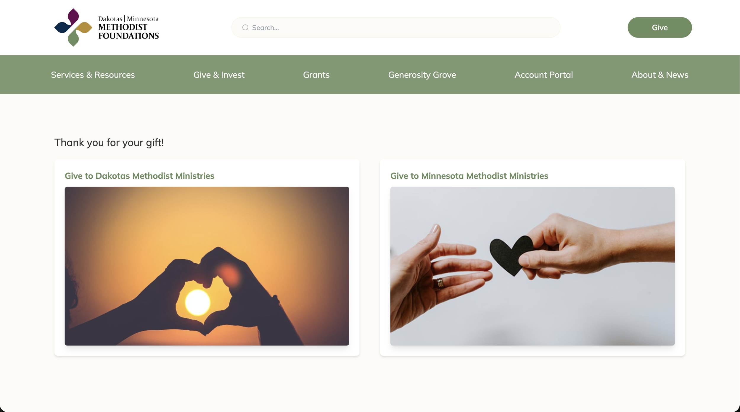
To address this, I designed shared navigation paths with dedicated landing pages that guided visitors to the appropriate foundation. For example, selecting “Donate” from the main navigation led to a page where visitors could choose which foundation they wanted to support.
I applied this approach across several sections of the website, allowing each foundation to maintain its own resources, news, and giving opportunities within the same website.
Wireframe & Prototypes
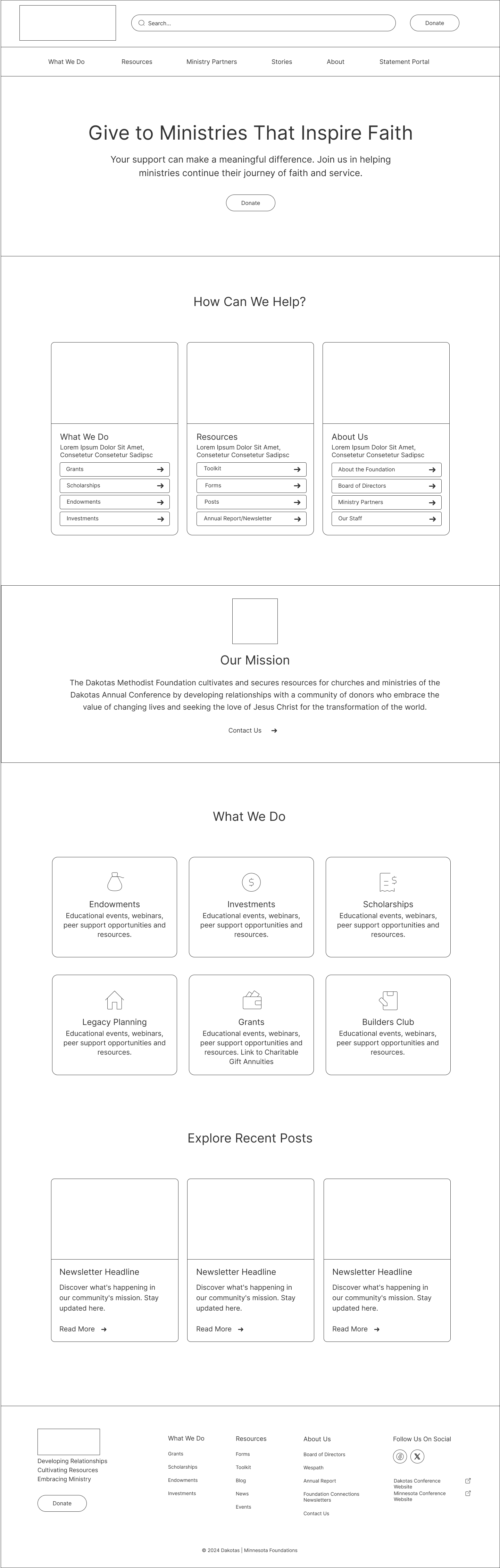
Homepage wireframe
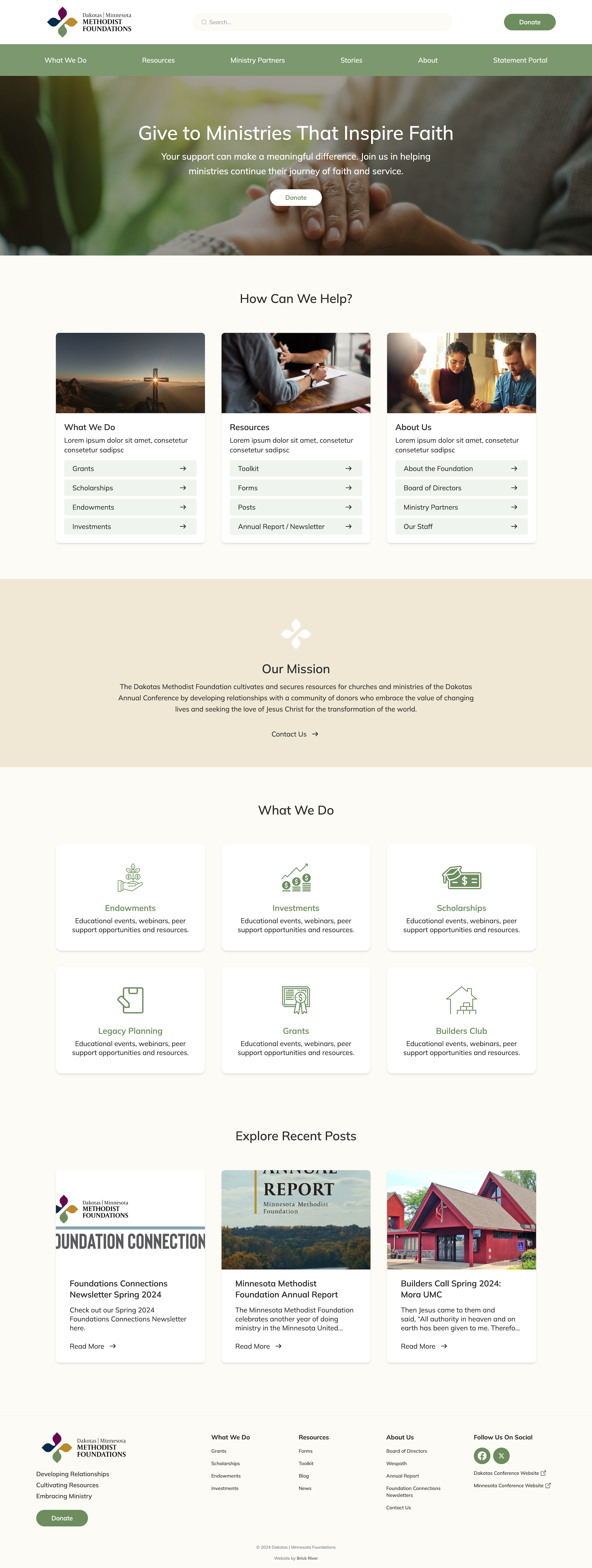
Homepage design
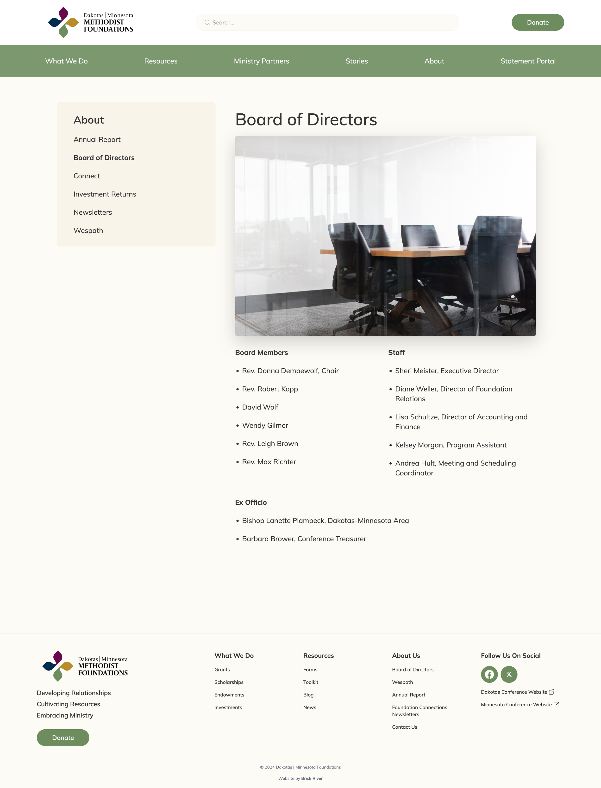
Inner page layout with sidebar
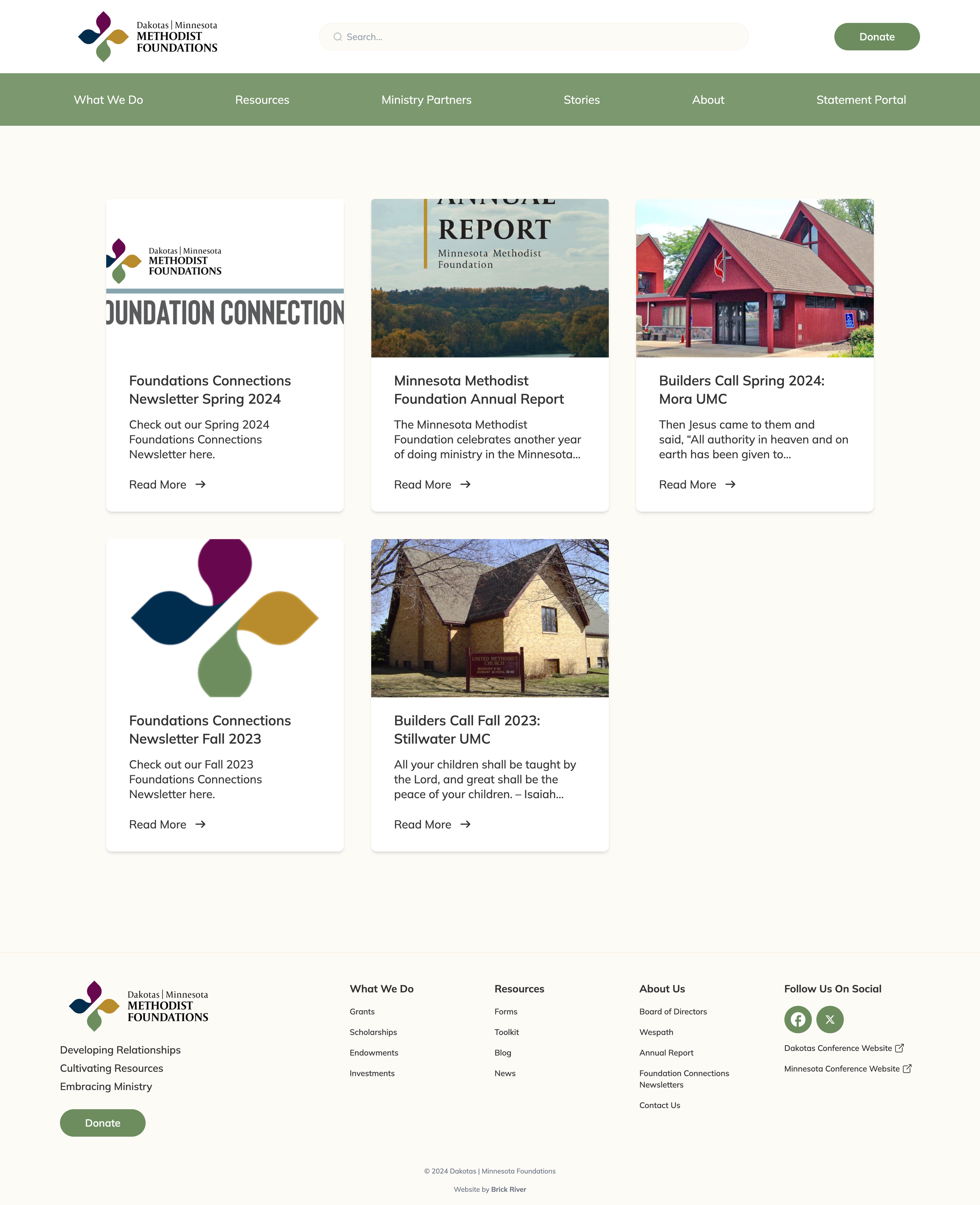
Cards design
Mobile First Design
Website analytics showed that the majority of visitors accessed the site on mobile devices, so I prioritized a mobile-first approach. I designed for smaller screens first, and used Tailwind CSS's responsive breakpoints to target specific screen sizes.
ConclusionThe final website brought the Dakotas and Minnesota foundations together in a cohesive, accessible, and responsive experience while preserving each region's identity.
The client was thrilled with the result, sharing that it felt as though I had "read their minds." The finished site delivered a warm, intuitive digital experience that reflected the foundation's mission and made its resources easier to explore.