Dakotas | Minnesota Foundation Website Redesign
Name of Product: Dakotas | Minnesota Methodist Foundation Website Redesign and Development
Client: Dakotas | Minnesota Methodist Foundation
Description: For the Dakotas | Minnesota Methodist Foundation’s website makeover, I set out to create an engaging and inclusive digital experience. The mission was clear: blend the distinct personalities of the Dakotas and Minnesota sites into a single, harmonious platform. Imagine two communities coming together, each with its own dedicated landing pages, but under one roof that feels like home.
I rolled out the digital welcome mat with a calming, earthy color palette that warmly says, “You’re in good hands.” Navigating the site is now as simple as a gentle stroll in the park, thanks to the intuitive, user-friendly interfaces I designed. I prioritized accessibility, ensuring that everyone, regardless of ability, can easily join in and find what they need.
To tug at the heartstrings, I sprinkled in images of people—because what’s more relatable than a friendly face? The foundation’s mission and resources were put front and center, shining a spotlight on the incredible work they do. It’s not just a website; it’s a welcoming digital sanctuary.
The project included:
Design Kick off Consultation
Wireframing & Prototyping
Website Development
Quality Assurance
CMS Implementation
Ongoing tech support
Software: Figma, Tailwind CSS, Alpine.js, ASP.NET Razor, XML, C#, HTML, Javascript
Wireframe
Color Psychology
Light Gold: Calmness, Serenity, Prosperity, Warmth, Elegance
Light Gold creates a soothing and welcoming atmosphere. It conveys tranquility and peace, fostering a serene environment that resonates with the nonprofit’s mission. This color also exudes a sense of warmth and elegance, adding a touch of refinement to the overall design. At the same time, it hints at wealth and prosperity, aligning with the foundation's goals of growth and positive impact.
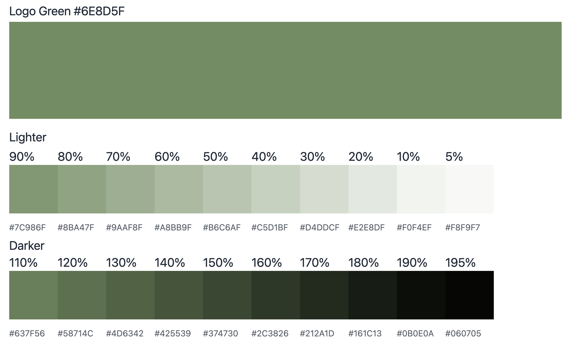
Green: Renewal, Growth, Prosperity
The color green is often associated with growth and progress, reinforcing the idea of a thriving foundation that is committed to making a lasting impact. This color also subtly suggests prosperity, reinforcing their mission of securing resources.
The previous website's lime green color scheme, although vibrant and eye-catching, didn't capture the calming and mission-driven essence the client envisioned. Lime green was energetic and intense, clashing with the nonprofit's goal of conveying serenity and trustworthiness. The client wanted a more peaceful and prosperous aesthetic that better aligned with their mission while retaining their existing logo.
For the redesign, I chose a refined combination of Light Gold and Green, which provided the desired balance between calmness, prosperity, warmth, and elegance.
Prototype (Figma)
Before
After
Conclusion
For the Dakotas | Minnesota Foundation's website redesign, I transformed their vision into a stunning, pixel-perfect design that resonates with elegance and tranquility. The client was thrilled with how the new site perfectly captured their essence, describing it as if I had "read their minds." Not only is the design visually appealing, but it is also fully mobile-responsive, ensuring a seamless experience across all devices. The colors and layout create a welcoming and serene digital space that reflects their dynamic mission and values, making the site both functional and engaging.


