Brick River Product Design & Design System Implementation
Project: Brick River Software Product Design & Front-End Development
Description: Brick River is an integrated nonprofit software platform that centralizes content, communications, fundraising, and data management into a cohesive, task-focused experience.
As lead Product Designer and Front-End Developer, I redesigned the Brick River platform used by 4,000+ nonprofit staff. I created a unified interface system, modernized the UI, and improved usability across all product areas.
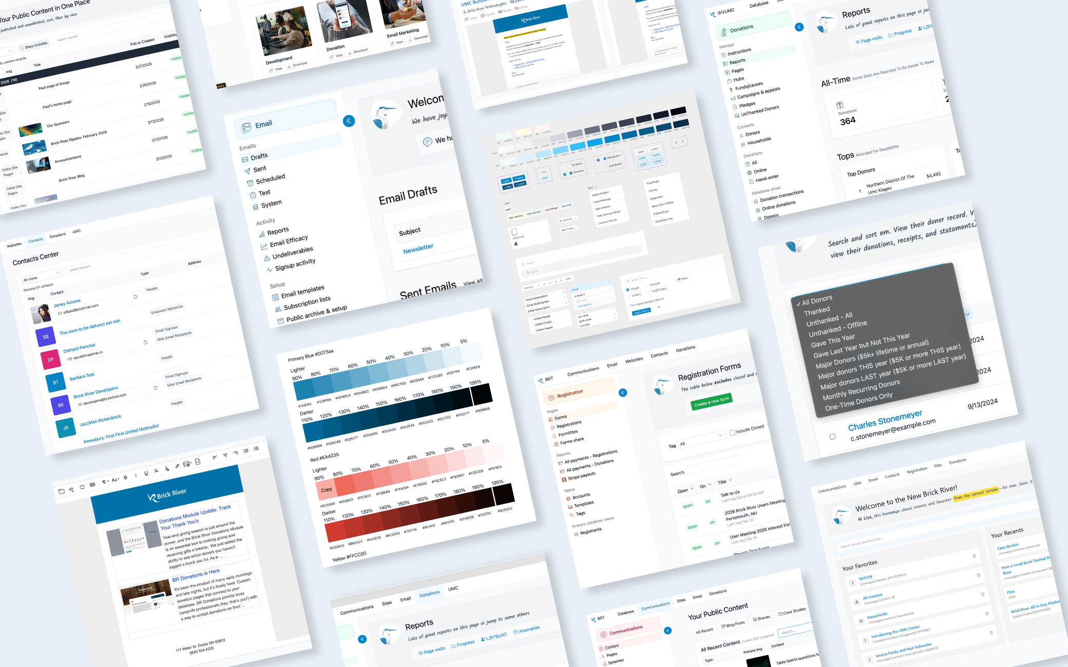
I replaced long, cluttered dropdown menus with task-based centers, giving users a single destination to complete related tasks.
Centers implemented:
Contacts
Communications
Events & Forms
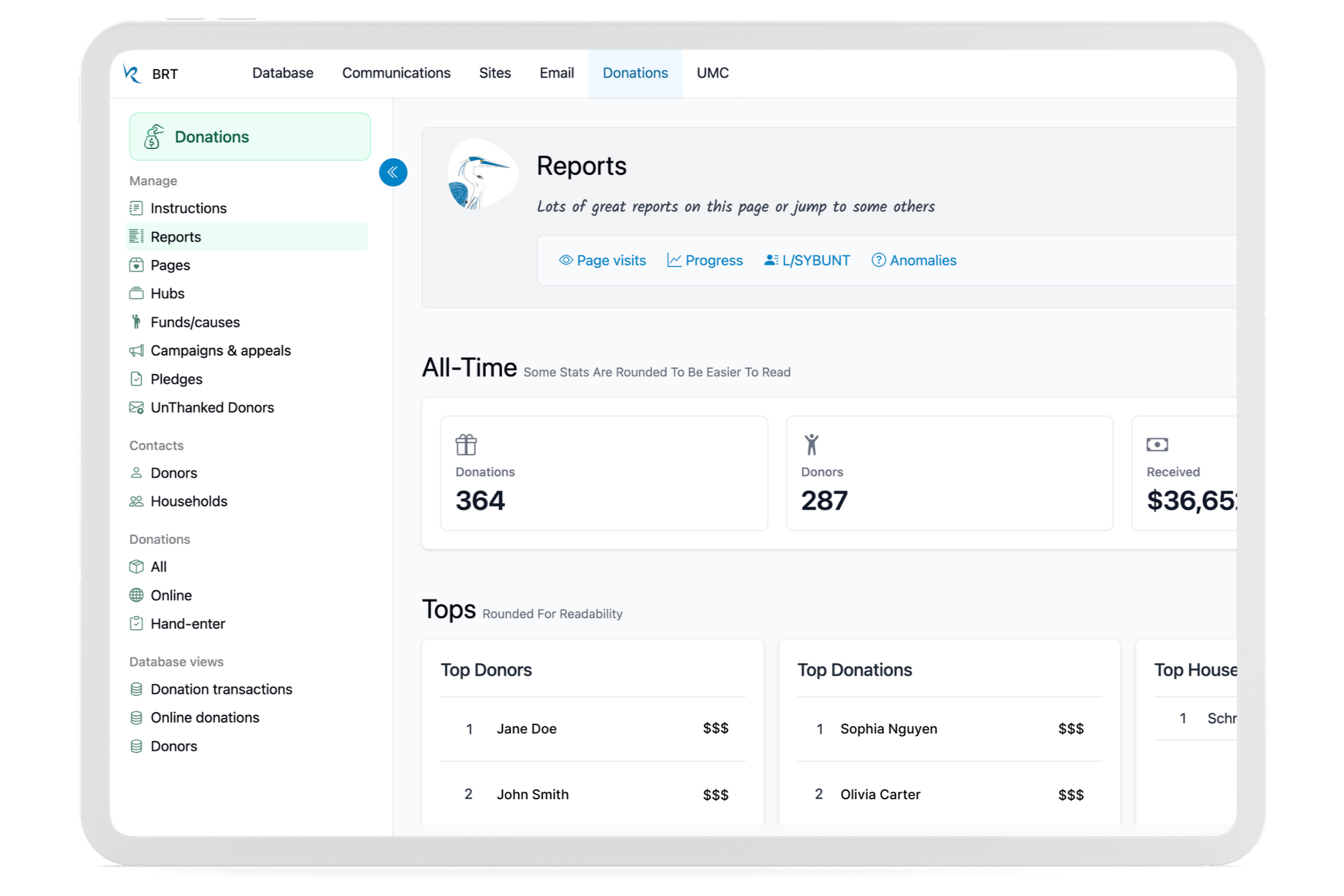
Donations
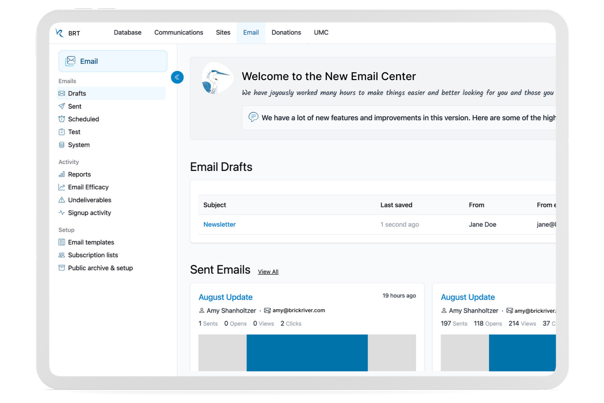
Email Marketing
Websites
Admin
Brick River Home
Software: Figma, Visual Studio, Git, HTML, CSS, JavaScript, Tailwind CSS, Bootstrap (legacy), Razor, C#, DataTables, ChatGPT
Design Question: How might we modernize a legacy platform into a unified, task-focused experience that simplifies complex workflows while improving scalability and consistency?
Key Contributions
Unified Task-Based Navigation
Replaced overloaded dropdown menus with task-focused centers, giving users a clear destination for completing related work.
Scalable Design System & Component Library
Built reusable UI components and standards to ensure consistency, scalability, and faster development across the platform.
Modernized Front-End Architecture
Transitioned the interface from Bootstrap to Tailwind while supporting legacy coexistence and improving flexibility and maintainability.
Workflow-Focused Interface Improvements
Introduced a collapsible sidebar, improved tables, filtering, and workflow patterns to support complex data tasks.
Human Centered Design
Added light color themes, freehand icons, and illustrations to create a more approachable, brand-aligned experience. Rewrote interface microcopy in reassuring and friendly language.
Created Marketing Website
Designed and developed complimentary marketing website for promotion that had the same look and feel of the product for a better user experience.
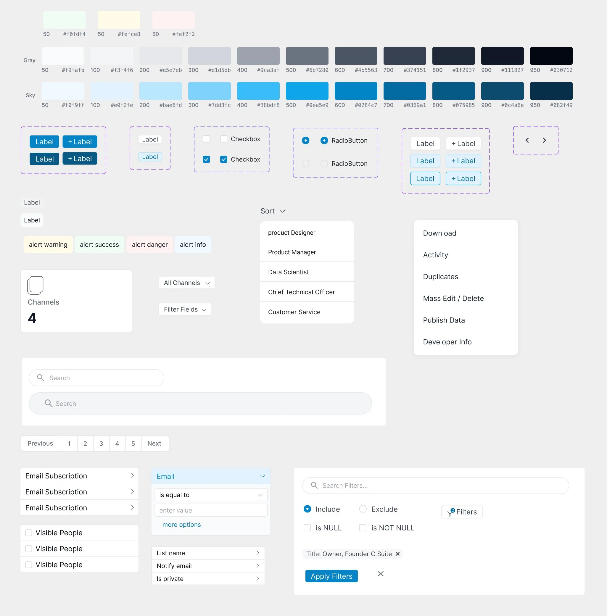
Design System
To support platform-wide consistency and scalability, I built and maintained a reusable design system that unified visual language, interaction patterns, and front-end structure across Brick River’s product ecosystem.
The system includes standardized color scales, typography, form controls, filtering patterns, pagination, alerts, dropdowns, modals, and data tables — all designed to work seamlessly across communications, donations, contacts, events, and websites.
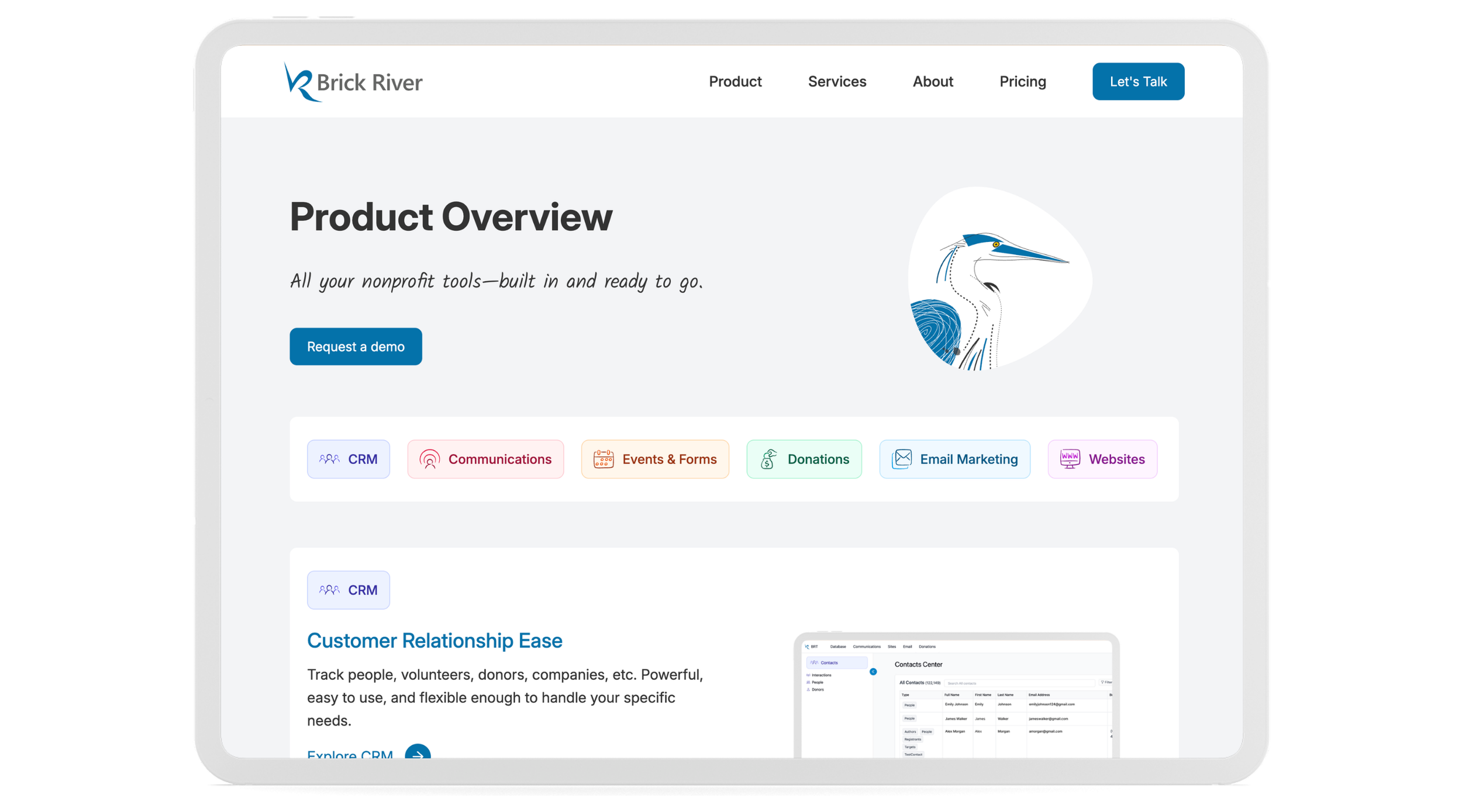
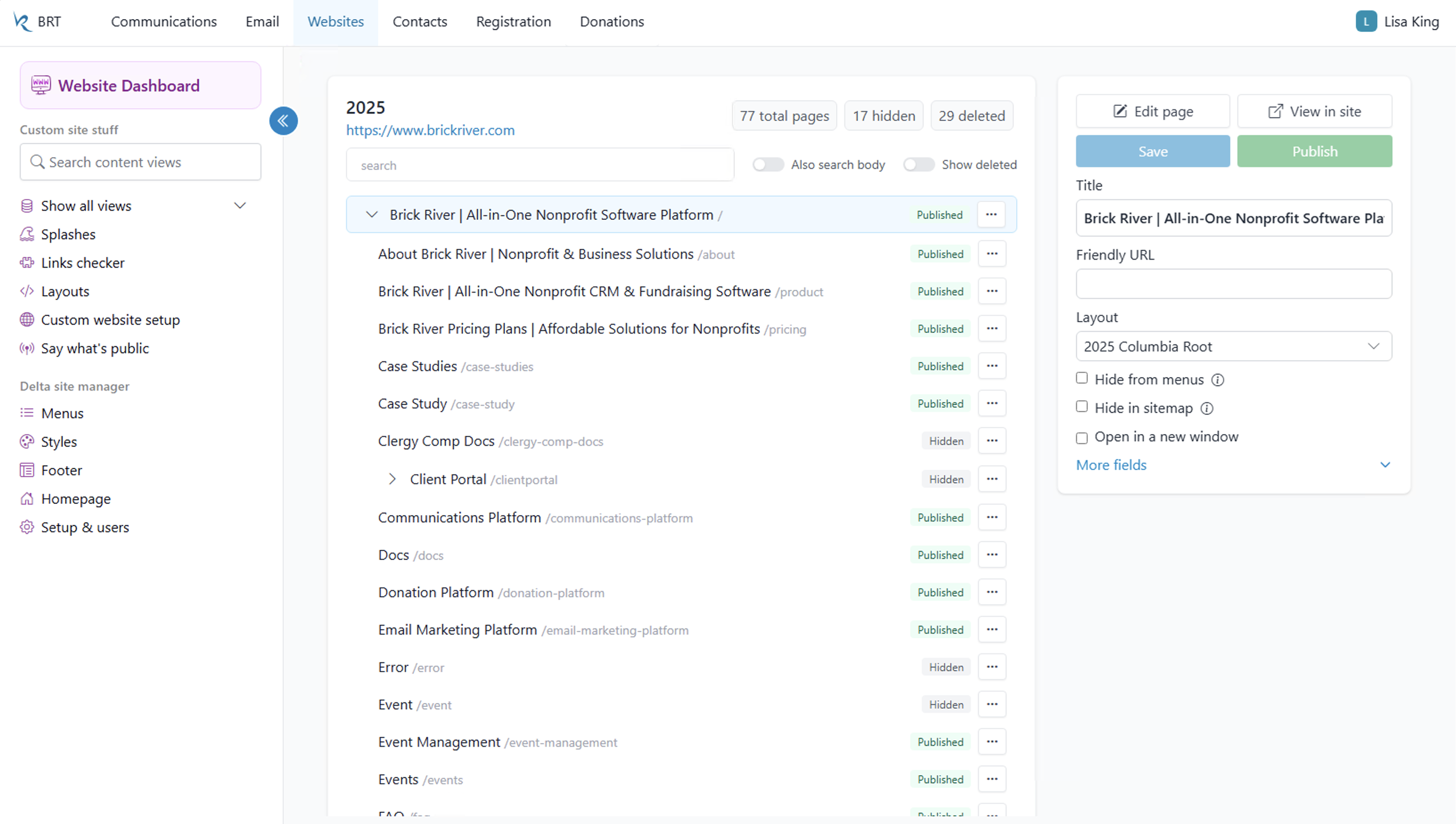
Websites Center Before
Navigation buried key actions in long menus
Dated Bootstrap interface
No quick access to frequent tasks
Websites Center After
Quick access to frequent tasks in collapsible sidebar
Prominent stats at a glance
Modern Tailwind interface with larger targets
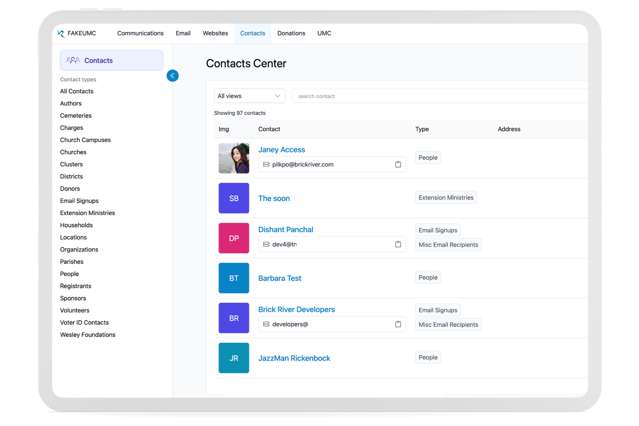
Contacts Center
Organize people, interactions, and donor data with powerful filtering tools.
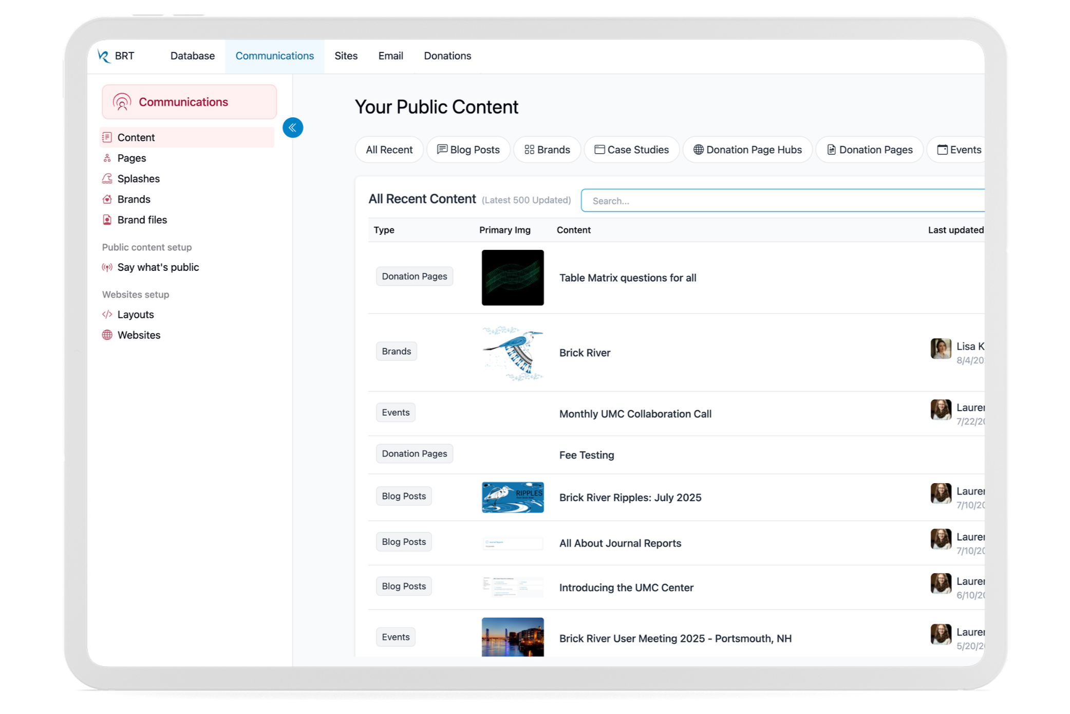
Communications Center
Manage and publish content across websites, brands, and public pages.
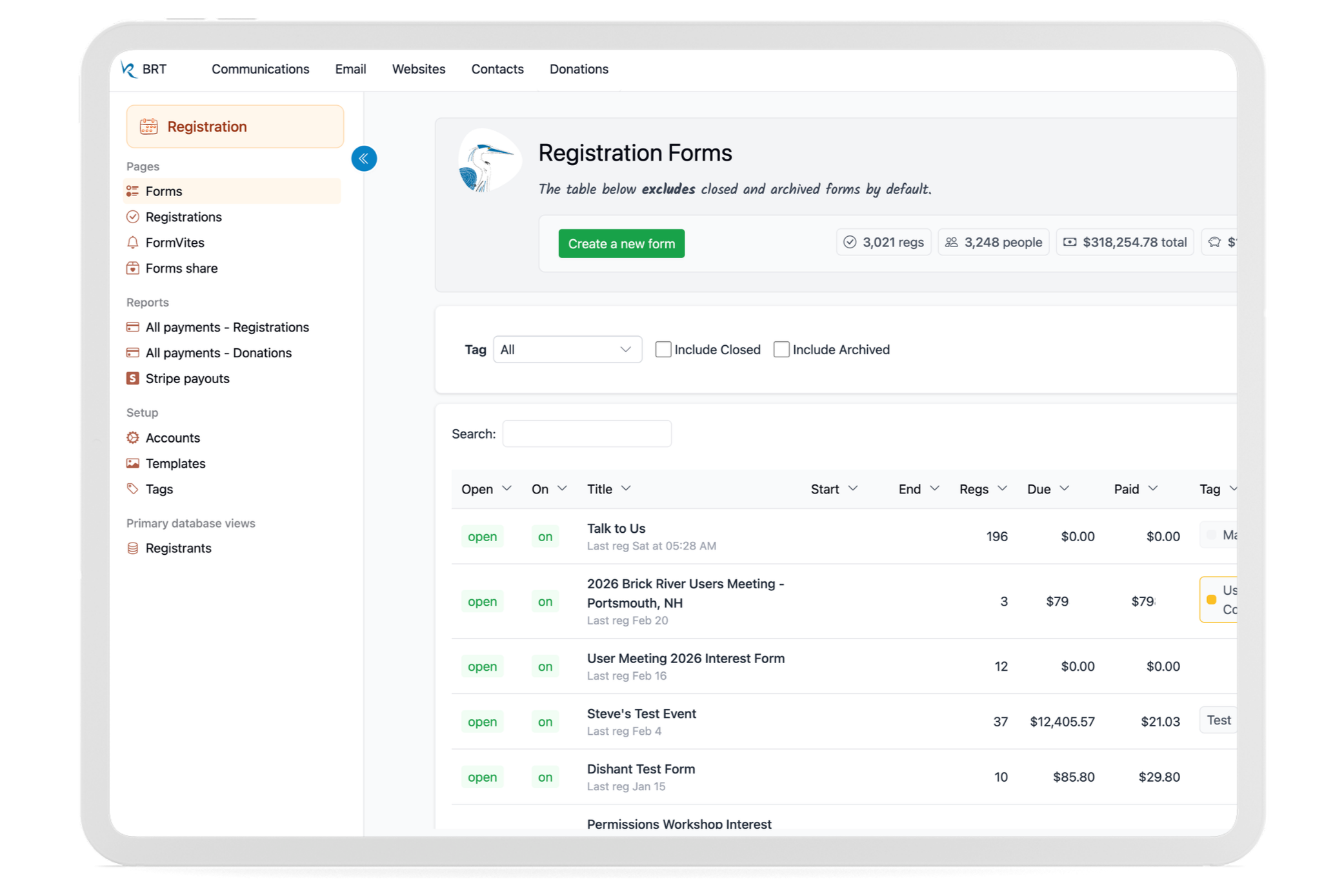
Registration Center
Build registrations, manage payments, and track participant data.
Donations Center
Track giving, manage campaigns, and analyze performance in one place.
Email Center
Create, send, and analyze campaigns with a streamlined authoring workflow.
Process & Insights
Design Around Real Tasks
I reorganized the platform around actual user workflows, replacing feature-heavy menus with task-focused centers to simplify the user experience.
Test with Real Users
I was in constant contact with nonprofit staff, observing how they navigated, where they hesitated, and what confused them. Feedback directly shaped iterations.
Prioritize Simplicity
Every interface decision aimed to remove complexity, clarify actions, and make the next step obvious.
Build Systems That Scale
Reusable components and shared interaction patterns ensured consistency across the entire platform for the whole development team to use.
Keep It Human
Subtle color, branded illustrations, and approachable microcopy made the software feel helpful and friendly rather than technical.
Conclusion
This redesign reinforced a simple principle: when software is organized around real user tasks and built with empathy, complexity disappears. The result is a clearer, more approachable platform designed for real people doing meaningful work.